
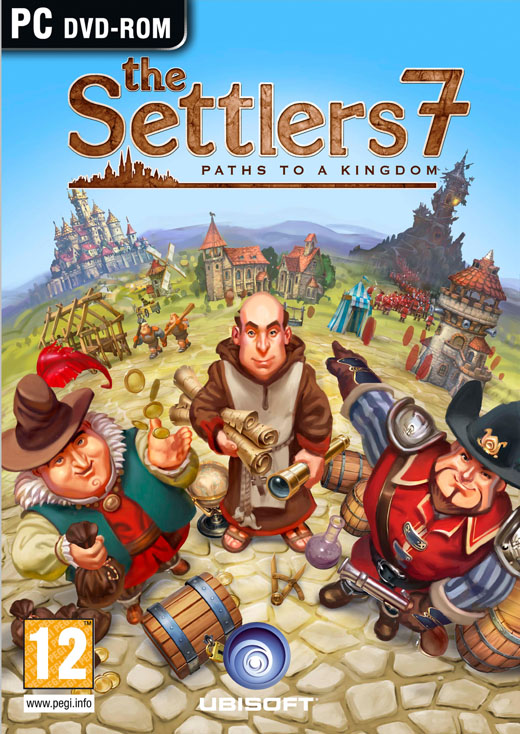
This is the British box art for the upcoming city builder / RTS Settlers 7:
This is the American box art:
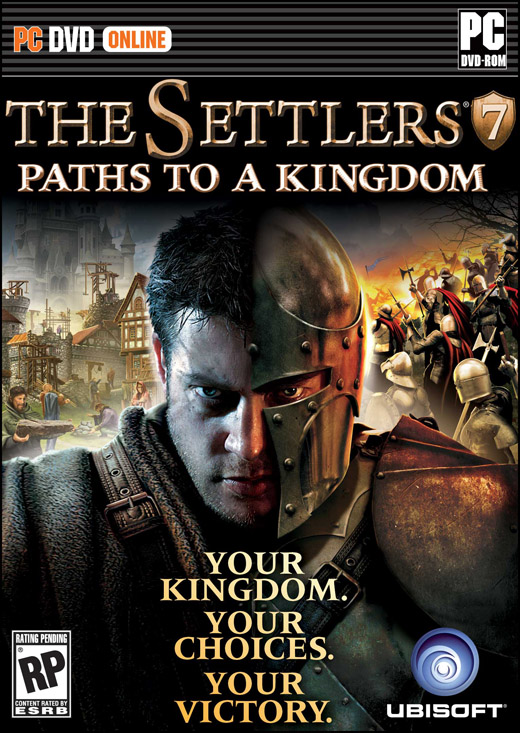
Same game, two very different tones. The British box is light and happy and full of daylight. The American box is dark and grim and full of fear. The British box says “This is a fun game”, the American box says “Games are serious business.”
What does it say about Ubisoft’s opinion of strategy gamers that they think that dark is what sells in America? And doesn’t this art go explicitly against the idea that Settlers 7 is going after a different audience than traditional RTSes? Because a black box with a grizzled soldier guy (weird since the hero of the campaign is a heroine) targets the exact same audience that other strategy games are going after. In fact, the same audience that every PC game without the word “Sims” in the title is going after.
(Thanks to Nabeel Burney of Slowdown for pointing me to it. He found the links to the To The Game images on the twitter feed of Alex May, developer of Eufloria.)
I think Ubi’s DRM means they don’t know how to deal with customers– their boxed art can thus be safely ignored.
More to your point: I find the use of “your” on the American box art to be interesting. Does that mean Americans are more selfish? Are we simply more possessive? Perhaps I should turn the frame around: maybe it’s English audiences that demand cartooniness. I wonder what the French or German art looks like?
Along those lines, I recall seeing some of the box Art for Empire: Total War. The British edition had a Union Flag behind red coated soldiers. The US version had the Betsy Ross flag and a blue-coated soldier…
Yet more proof that Ubisoft is completely out of touch with the trends in PC gaming. You’ve just turned off more than half of your potential audience.
Heh, Ubisoft is not the same company to make this mistake.
That is weird… The British cover sells the game a lot more to me. The American one looks generic at best, the British one looks like it is going for a slightly comical appeal.
On the plus side, it did make me laugh at just _how_ different they are. As did the Kirby ones.
They should sell both boxes in the U.S. and see which does better. That’d be an interesting study.
Also worthy to note that the “7” is much larger on the UK box, presumably since it has a larger following there?
I will be honest, the first thing I looked for in Settlers is if it had combat in it. Also Dawn of Discovery for that matter. So maybe the American box does indeed fit me more
Wow, the US version looks truly absurd. Especially considering the general character of the Settlers series.
Thanks for sharing.
Interesting to note that while helmets are apparently too militaristic for Europeans, pauldrons are apparently okay. Also, to be pernicious, I guess the inclusion of Mr. Moneybags on the European box means Europeans are all just money-grubbing greed mongers? ;)
I like the American cover better; the Brit one looks like a kids game. I will say that I would then turn the box over for screenshots, and if there aren’t any hex grids I probably wouldn’t buy it. I’m joking, but seriously how the hell do you sell an RTS that isn’t militaristic on store shelves?
I am glad that it is MY Kingdom, MY choices, and MY Victory: I don’t like when games like Majesty have the heroes take all the credit for all my hardwork taxing them and building stuff.
The British version reminds me of Anno or Majesty; The American reminds me of the slapdash covers of those Leisure paperbacks you find on the impulse racks at Borders. Yikes.
@ Punning Pundit:
Empire’s box art was similarly changed for several other countries. Most of the (extant) major nations from the game, I believe.
I’m also surprised to see that unlike Settlers 6, Paths to a Kingdom isn’t Games for Windows branded.
The US cover makes me think Settlers 7 is an action game. The UK cover puts me in the mind of a boardgame.
I wouldn’t give the US cover a second look if I saw it in a store to be honest. It just cries out generic-third-person-hack-and-slash.
The UK cover looks like it’s for a Wii game.
The “happy” box looks like something my little girl would play. The “dark” box oozes exactly that: blood, devestation, death, conquest (in no particular order).
And, sadly, that is more okay in the U S of A than the display of certain manly or girly body parts…but, it’s an imperefct world, so….
Who is afraid on the American Box? One group of people (over his right shoulder) are pulling together to build up a city… the other group of people seem to be having a pretty good time as well…
If you could just tell that dude to move his big melon… pretty solid box cover.. especially the art style of the city builders… Paths to a kingdom… I think the American box is more interesting.. the Brit box looks more like the are looking for the Yellow Brick Road…
I don’t think the difference is mainly a light/dark thing. It’s that the UK box sells the game as primarily a city builder, whereas the US box sells the game primarily as about war. Presumably because city builders sell well in Europe (even the UK, though not as much as Germany), whereas as tradional RTS sells in the US (to the extent that any strategy games do). This is exactly what I was talking about when I said that Ubisoft should stop trying to go after a (seemingly American) audience that doesn’t want to play Settlers games. There is an audience for them, if you don’t keep screwing up the formula and marketing them so absurdly. Settlers is a city building series. Stop trying to hide that fact and make the most of it.
The American box is absurd. It makes the game look like a first-person meleer or action-RPG. The British box actually show what the game is about.
What I really want to see is Japan’s box.
By the way, will there be an Arsenal of Democracy review?
If I can find time to play it, I will have some comments on Arsenal of Democracy.
The stern looking face on the cover is a staple of box art imagery, but it says very little about the game. Compare with the cover art of games like Medieval II: Total War, X-Men Origins: Wolverine, or StarCraft.
The goofy British cover gives more of the classic Settlers’ feel that I’m used to. It’s more appealing to me now.
The American cover would’ve appealed to me 10 years ago when I was 19, but it looks rather generic today.
Neither are too inspiring. Oh well, no real complaints from me. I’ll miss PC videogame boxcover art when we’re all digital downloads or console gamers. Then I’ll be like those oldtimers who talk about record jacket artwork or whatever those things were called.
The British cover pretty much matches the style and character of the cover for the original game version (I have that one around somewhere), and definitely appeals to me in that nostalgic sense. It is also, or at least used to be, fairly youth friendly and would appeal to me as a gamer and as a parent (my 4 year old might like to watch me play).
The American cover just gets ignored. It is completely generic, with no hint of the character of the game. It wouldn’t have appealed when I was 19 or 25, and certainly not now. It is a totally forgettable cover. Oh, and the Ubisoft logo kind of disappears on the British box, while it’s accentuated on the American box. With the current state of affairs, as well as my previous experiences with poor UIs from Ubisoft would tend to bias me heavily against a purchase.
Wow I thought the US boxart was a jokey ‘shop job at first. If I was the art director for the game, I would be furious at Ubisoft marketing.
I can see how they came to the conclusion to pick that boxart…18-35 male demographic who watched 300 and UFC fights. Unfortunately for them, the game itself is probably not going to appeal to them.
Americans like violence, Europeans like titties.
There might have been a time (let’s say from May 16th 1986 till January 3rd 1987) where a North American upbringing led a child to less resentment to violence than a European upbringing would have. These days, however, it’s just marketing, whose main concern is continuity, not who a product’s audience comprises. Recognition not necessarily of a product’s content (which is still important), but of the degree within and the organization of entertainment as a whole, is key. North American game covers show a variety of frowning men and women with a distinct color restriction, why should The Settlers’ differ? It’s true, Kirby just got new eyebrows, but a brown Kirby wouldn’t have been recognizable at all.
The Sunday Papers | Rock, Paper, Shotgun // Mar 7, 2010 at 6:14 am
[…] We’ve been going back and forth on actually posting this for a week now, but fuck it. It’s marketing, not the game. Compare and contrast the Europe and US covers for Settlers VII. […]
I think Ubisoft’s money says they don’t care what you all think because they obviously know how to sell games. Why would the rich take financial advice from the poor to hand over their money to the rich like suckers?
Just about everybody who prefers the American box art has, by their own comments, implicitly admitted that they’ve never played a Settlers game.
@Bowser: As an American, for me it’s less telling Ubisoft what to do, more being offended by how low Ubisoft’s opinion of me is.
As though somehow the generically gritty bottom choice is automatically what I’d go for.
@Cautiously Pessimistic
The money is falling into his hands from the player.
Traffic Analysis January to July 2010 // Aug 1, 2010 at 12:00 pm
[…] only content page that beats my Civ 5 post in was a stupid throwaway post comparing box art for Settlers 7. That got linked everywhere, and made Reddit the number one referring site for the blog. After the […]
Missed this post when it first came out – absolutely hilarious.