

Monday night was a twofold attempt to figure out games and being stymied.
On the computer end, it was Paradox France’s Pride of Nations; it’s not that it’s complicated as much as it is that I just didn’t have the patience last night to sit through five tutorials that mostly amounted to me scrolling through five point font to learn different systems. I am looking forward to being in the mood, because it’s a game I’ve been looking forward to since I saw it in January.
Then there was trying to figure out how to play Republic of Rome solitaire. That wasn’t much more successful, probably because my recollection of the normal rules was iffy at best.
As I looked at the board, though, something hit me. This is a terrible board.
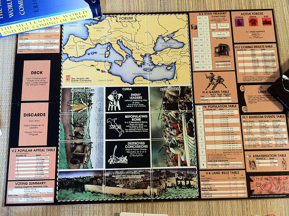
Republic of Rome‘s board is a monstrosity by any reasonable definition of style or art. There are die roll tables on both sides, six boxes right in the center of the board under the map for different war and political piles, spots for discards as if you couldn’t just stick those cards somewhere off the board. This is a game with a lot of different types of cards and those cardboard chits that I know I will lose but everything in the game has to go somewhere on the board it seems.
But, to be fair to RoR, there is a lot of information to track. Population, foreign wars, treasury, legions available…you can argue whether or not you need every die roll chart on the board, but you would just end up looking at the manual all the time anyway, so this saves time. This is a complicated game with a lot going on even beyond the real focus of the game – the political battle between factions.
There is no Eurogame elegance to the look of the Avalon Hill bookshelf games, but then there is no Eurogame elegance to the rules either. It’s astonishing how small the board is considering how much it has to represent. An inch or two in both directions would make it less likely your stack will bump into each other and become one of those chit soup messes that happen from time to time.
Anyway, I will be going back to both Pride of Nations and Republic of Rome this week. Both have user issues, but at least Pride of Nations has a built in tutorial and the errata will be taken care of in a patch.
The Valley Games reprint of Republic of Rome has a huge board and yet it’s still impossible to fit everything on there. This is a classic example of ‘old school’ game design that really needs to be taken out, shaken down and given a fresh coat of paint. Republic of Rome could be a truly fantastic game if someone streamlined some of those odd rules about how linked wars start and made the board more presentable!
I have to disagree. Sure, the RoR board isn’t attractive, but it is functional. Would you rather have those charts on separate player aid cards? Not me. I’m sick of having to shuffle through those damn things to find information that should be closer at hand. At least, with the charts on the board, the designer has to think about how best to consolidate and organize information, instead of randomly slapping them on various cards. (Check out Command & Colours: Napoleonics for an example of how not to do player aids.)
RoR is a multi-player game that happens to have a pretty good solitaire game. You couldn’t design a board that would accommodate every player’s faction, including all the cards and tokens. So, Avalon Hill went the route of putting the shared content (the Forum, war cards, etc.) on the board, with player-specific content off-board.
If memory serves, the reason for the discard box is to keep real discards separate from played Laws.
Still, the board is functional, but not instructive. It’s not very helpful for a new player, but it’s tolerable for a more experienced hand. I can’t remember where I saw a tutorial for RoR, but there is a decent replay at http://boardgamegeek.com/thread/618840/you-too-andrew-a-late-republic-play.
Good read, but in the interest of equal time, now you have to do an entry on a good boardgame layout. No joke. Let’s have it, Goodfellow!
Way ahead of you on that, Tom, except I need to decide where bad UI starts and feature creep ends. But I have some drafts.
The problem with Republic of Rome is you. It’s not a light game, it’s not easy to learn because it’s trying to do a lot, and it does a lot well. It’s not a dry, boring (oh but so elegant right?) Euro, nor is it an ameritrash dicefest, ROR is something special. A lot of the board is covered with the charts you need to go through some of the phases so you don’t have to flip through the the book. The rest are just ‘holders’ for cards, one place for armies raised and two tracks. I would comment on the UI of the board after you actually learn how to play the game.
It’s interesting what current gen wargame designers are doing in non-wargmames. Chad Jensen, for example, designed Dominant Species. The board is quite large, but lays out almost all the gameplay mechanics in an elegant, but somewhat sparse way — almost the antithesis to RoR.
OTOH, I’ve also recently played the new Sid Meier’s Civ board game (designed by Kevin Wilson). On the one hand, the main board is a clean, easy to parse design. On the other hand, the “market” board is cluttered and hard to read, but that’s because it’s overloaded with information.
Of course, Chad Jensen also designed Combat Commander and Fighting Formations, two game systems that are chock full of charts printed on separate player aid cards.
“It’s not a dry, boring (oh but so elegant right?) Euro”
Oh dear, sounds like littlemute was molested by Reiner Knizia.
RoR is exactly the sort of game I’d describe as dry and boring, actually. And that’s amazing given that it’s about one of the most interesting periods in history.
I’d love a review of the UI of the Valley Games RoR edition. I’m dying to try the game, but I’m hoping for a 2nd Edition that corrects the inevitable Valley Games errors.
I wish more games were as “dry and boring” as Knizia’s.