While doing my weekly conference call with Dirk Knemeyer regarding the board game we are working on, we got onto the topic of components. Well, not exactly. We got onto the topic of math and measurements and geometry, but basically it came down to what we expect from components.
When people praise a board game, they’ll often talk about the quality of the components. Is it a good solid board? How big is the typeface? Are the playing pieces symmetrical or well-drawn? Components are very important for drawing in players; we all remember the childhood fights over who got to be the car in Monopoly. And I think that the fact you are using plastic army men accounts for a lot of the popularity of Memoir ’44.
We can’t lose sight, however, of the fact that component quality is about more than mere artistry or selling a theme. Good components are integral to making a game, if not easier to understand, at least more fun to want to understand. You can argue about whether Command and Colors: Ancients really needs to make you apply 200 stickers with each new expansion, but the high quality wooden pieces with distinct symbols on the images’ upper right conspire to make C&C feel like you are pushing old fashioned wargame blocks around. The terrain tiles are perfectly clear and you rarely need that many to make a battle map. The original boards were crap, but mounted boards have since been released.
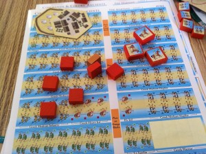
On the other even simpler side, you have A Few Acres of Snow, with simple wooden blocks and discs, along with cards with a symbolic language so clear that you can teach the basics of movement in two turns; your pupil will not get confused because the card components make it almost impossible for a literate person to get lost. (I am still confused on sieges, but that’s a rules thing.)
When we talk about computer strategy games, or at least when we in the media talk(ed) about them, we rarely speak the language of components. We talk in terms of graphics and UI which are software terms, not game terms. It’s part of the messy legacy of computer gaming, the same legacy that relegated any discussion of games to the tech pages of major media and not the culture pages.
The problem is that graphics are, like meeple art, just a single part of the component problem in a strategy game. And graphics in most video games can be really indistinct from UI in many ways. Setting unit paths in a Paradox grand strategy game, for example, is a matter of UI (left click select unit, shift-right-click to set waypoints) but the progress of movement, style of the movement arrow and other things are graphics. Being able to recognize a unit at all is the perfect blend of graphics and UI.
Now, in a computer game, components can be purely artistic. To go back to the Paradox games, I am one of those suckers that bought every single unit sprite pack for Europa Universalis 3, even though I haven’t bought Atom Zombie Smasher. Unique uniforms for all the major (and some minor) European powers! It’s not like I had any difficulty distinguishing between the French and the Spanish, but this is just nicer in a silly way.
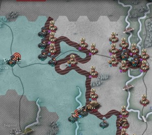
I think of components when I look at Unity of Command. As Bruce so eloquently laid out on the podcast last week, the art of the units is distinct enough to know that your crappy Hungarians are going to get rolled over in turn one, so hide the schnitzel. But take a look at the entire board. Unit supply and strength are not disaggregated numbers – strength is marked by a circle, supply is when that circle is blue. Supply points (this game is really all about logistics) are easily found with a single keypress, but the only information you really need is where supply ends; this is the information that UoC throws in your face.
I think of components when I think about Age of Empires. Bruce Shelley pointed to the setting of the game as a design strength because the units’ abilities and purposes were apparent simply by looking at them. Archer? Archer on horseback? Spear guy? You needed to know almost nothing to know what did what. Age of Kings added very distinctive unique units, more distinct components than you would find in the otherwise superior Rise of Nations.
I think that strategy game criticism in general would be better served if we started adopting the component mentality that you see in board game criticism. No, some very complex strategy and wargames cannot have simply intuitive components. There is no reason to expect a deep and comprehensive game like War in the East to break new records for transparency (even though it is actually elegant in many ways.) The components in use must fit the design in order to make sense, and if they don’t then you end up with too many menus or an abstraction too far.
But if we can get to the point where we accept that – for game spaces – appearance and functionality are intimately related, and that the old canard that “graphics don’t matter” is just plain silly when you have to actually look at how units, maps and information are best displayed then we can actually understand design better.
By focusing on components instead of “graphics” we can get away from the idea that realism or traditional portrayals of strategic elements are necessarily the best way forward for design in the genre.


I think it comes down the old mantra about how form follows function. Archers don’t look the way they do because of any particular aesthetic choice; they look that way because their visually distinguishing characteristic is the very tool that defines their function. Of course, even that is a clever bit of trickery–we already have a general sense of how archers are supposed to work without having to read the specific game rules. This is why starfighters have wings, and why battlemechs have arms (well, most of them anyway).
Still, this can become a problem when form and function aren’t readily distinguishable. Using Civ IV as an example, it’s easy to tell archers and spearmen apart, but it’s less obvious whether your guys are city-defenders or forest-terrain specialists. Of course, these are advanced problems, complexities that only arise when you have a computer to track these things for you. It’s a strange challenge when you’re able to model information more complex than can be readily conveyed to the player; in the old days, that information would simply be discarded.
As a board gamer I find components to be half the reason I even buy a game, let alone play it. Half the games I own are for the component quality. I think the graphical and component quality in board gaming is similar to that of graphics in video games: it amps up the fan base and can make a little known game into a blockbuster. Would anyone own a PS3 if they didn’t care for the graphics of the games on it? I think half of the BGG top fifty are there because people love the bits of those games.
A Few Acres of Snow is my favorite game from last year, and a big chunk of that is how functional the components are. At one point, my opponent and I could set the whole thing up in about three minutes and then take the first turn.
Sieges: card that connects + form of transportation + military symbol/unit. Just like settling a location, but instead of a settler (when that applies) you use a card with military symbol(s). Then you can take an action (if you have one available) to add a card with military symbols to the pile for the siege (if any such cards are in your hand). If you get enough points in your favor at the beginning of your turn, then YAY! and play a settler (when that applies) to place your nice little cube down.
Agreed! Looking outside strategy to the FPS realm, it’s probably another reason why we keep seeing tired weapons such as shotguns endlessly recycled IN SPACE.
With science-fiction games, I think this ties in with the “I can’t make heads or tails of the far-future tech tree” issue. Both relate to an ostensibly cosmetic element that, in fact, has real implications for ease of use.